Brand identity · Signage · WebsiteOne brand from the front door to the browser tab.
A coworking and business centre was about to open its doors with no name on the wall, no identity, and no page for the people searching for a desk.
- Client
- EasyHub
- Sector
- Coworking · Business centre
- Year
- 2025
- Duration
- 5 weeks
- Branding & Design
- Signage
- Websites
A space ready before the brand was
The space itself was almost finished — reception, offices, meeting rooms. What did not exist was everything a member meets before walking in: the sign that tells them they are at the right address, the page that tells them what it costs, and the documents they sign once they join.
A coworking brand is judged on two things: whether the place looks professional enough to bring a client into, and whether the information is easy to find. Neither was in place.
No identity for a space that was weeks from opening
No signage at the entrance — visitors could not confirm the address
No website, so nobody searching for a desk could find pricing or contact
Member documents and contracts had no consistent layout
Build for the walk-in and the search
Two audiences matter for a business centre: the person standing in front of the building and the person searching from a phone. We designed for both at once.
Read the space
We worked from the finished interior — its materials, its light, its reception — so the identity would sit naturally in the building rather than fight it.
Identity and guidelines
We built the mark, the palette and the typography, then wrote the guidelines so the same standard carries from a business card to a wall.
Signage and stationery
We produced the entrance plaque and the stationery together, checking the mark at reading distance on a wall as well as at ten centimetres on paper.
Website with the answers
We built the site around the three questions that actually get asked: what is included, what does it cost, and how do I visit.
What we delivered
From the plaque on the entrance to the page that brings people to it.
Identity
- Logo system with the versions needed for print, screen and signage
- Colour palette and typography with exact values
- Written brand guidelines
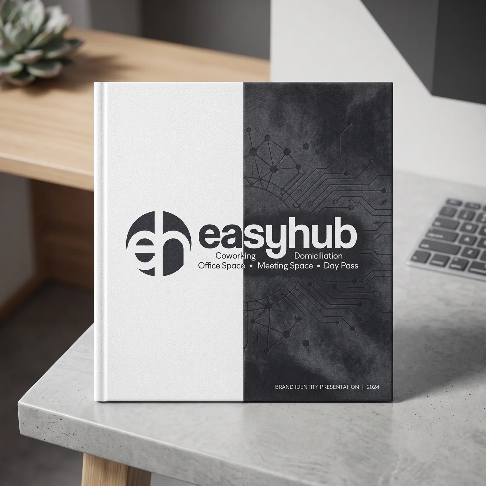
- Identity showcase for presentations and partner material
In the building
- Professional entrance plaque
- Reception application of the identity
- Stationery set — cards, letterhead, member documents
Online
- Website covering offers, pricing and the space itself
- Enquiry and visit-booking form routed to the team
- Google Business Profile set up so the centre is findable on the map
What itactually looks like.
Identity presentation
⚠️ Placeholder image
What changed,measured.
Opening
brand ready before the doors
Signage, stationery and site all delivered ahead of launch
Wall to card
one identity across formats
The entrance plaque and the business cards use the same system
Editable
website handed over
Offers and pricing updated by the team without a developer
- Visitors can confirm they are at the right address before they walk in.
- People searching for a desk find pricing and a way to book a visit.
- Member documents leave the centre looking like the space they just visited.
For a business centre, the plaque and the pricing page do the same job — they both tell someone this is a real, serious place. We built them as one piece of work.