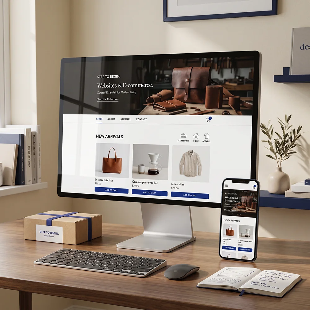
Open the last five business websites you visited on your phone. Count how long it takes you to answer three questions: what does this company do, is it for someone like me, and what am I supposed to press. If any of them took longer than five seconds, that site is losing customers it never hears about.
This is not a design problem. Plenty of beautiful sites fail this test and plenty of plain ones pass it. It is a sequencing problem — the order in which you tell someone what they need to know.
What has to be visible without scrolling
On a phone, the first screen is roughly 600 pixels tall. That is all you get before someone decides. Four things have to fit in it, and nothing else earns a place:
- 1What you do, in the words your customer would use — not "innovative solutions", but "we install and repair air conditioning in Tangier".
- 2Who it is for. One qualifying detail is enough: a city, an industry, a size of business. It costs you nothing and it tells the right person they are in the right place.
- 3One reason to believe you. A number, a rating, a recognisable client, a guarantee. One is plenty; five reads as insecurity.
- 4One action. A single button. Not a menu of six, not a form with nine fields — one thing to press.
The three mistakes we see most often
These come up on nearly every audit we run, in roughly this order of damage.
A slogan instead of a sentence. "Your success, our passion" tells a visitor nothing. It is the most expensive line on most websites because it occupies the single most valuable position and communicates zero information. Replace it with what you actually do and watch the enquiries change.
A carousel. Sliders exist because a team could not agree on one message, so they compromised on five. Visitors see slide one and leave; almost nobody waits for slide three. If three messages matter, they belong in three sections, in order of importance.
Every button competing. "Call us", "WhatsApp", "Get a quote", "Download brochure", "Follow us" — all the same size, all in the same place. When everything is emphasised, nothing is. Pick the one action worth the most to your business, make it visually louder than everything else, and demote the rest.
Speed is part of the message
Most of your visitors are on a phone, on 4G, standing somewhere with two bars of signal. If the first screen takes four seconds to appear, half of them have already left — and they left before your carefully chosen headline ever rendered.
- Compress and resize every image. A 3 MB hero photo is the single most common cause of a slow site.
- Load the fonts you actually use, in the weights you actually use. Two weights is usually enough.
- Do not load a chat widget, a cookie tool, three analytics scripts and a font library before the text appears.
- Test on a real phone on mobile data, not on your office wifi.
What to do this week
You do not need a redesign to fix most of this. Open your home page on your phone and do three things: rewrite the first line into a plain sentence a stranger would understand, delete every button in the first screen except the most valuable one, and compress the top image. That is an afternoon of work, and in our experience it moves the numbers more than a new theme ever does.
A website does not have to be beautiful to work. It has to be understood.
In short
- A visitor answers three questions in five seconds: what, for whom, what next.
- One action per screen. Every extra button reduces the clicks on the one that matters.
- A plain sentence beats a slogan every single time.
- Speed on 4G is not a technical detail — it is whether your message arrives at all.
Hamza El Ghad
Runs Step to Begin, a small studio in Tangier building websites, automation and video since 2019.